How to Design a Great Trading Pin or Patch
From the distinction of military groups to a non-profit organization, patches offer the opportunity to display a symbol that last lifetimes. This kind of symbol placement is not limited to...
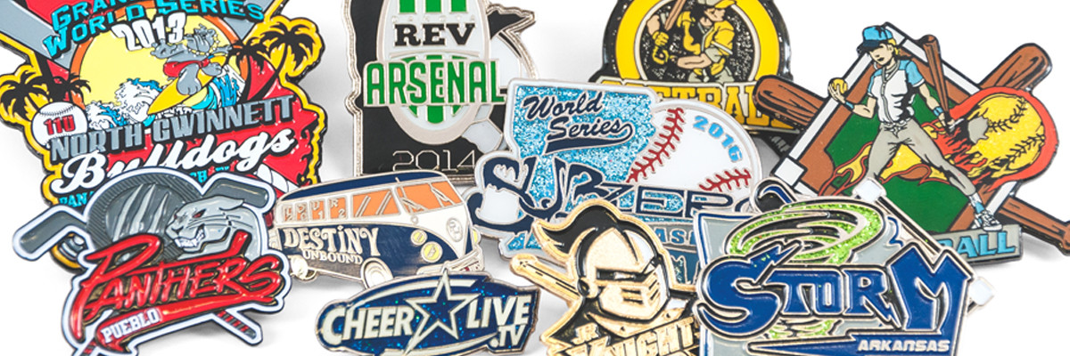
From the distinction of military groups to a non-profit organization, patches offer the opportunity to display a symbol that last lifetimes. This kind of symbol placement is not limited to patches, however. Trading pins, lanyards, challenge coins and wristbands alike all act as a platform for some of the most recognizable designs.
We are here to help you do the same. This is your guide to successfully designing your patch, giving life to your logo or idea!
No matter your design, you want it to be universal. This means not being limited to just one medium. Your design should be able to be conveyed across any item, from a patch, down to a trading pin. Let's take a look at how to get started.
Who, What, Where
Starting is the hardest part, but have no fear! Ask yourself, "What is it I am trying to portray and is there any physical thing that is recognizable?" The direct use of objects is a great place to start in your design.
Shapes such as states, vehicles, devices, and objects can be a fantastic platform to bring your idea to life, so long as you supply the shape.
If you plan to say something, say it bold. Lettering is timeless and can be a great way to convey your idea on things such as a trading pin or lanyard. A banner style or rectangular patch is a good way to headline your phrase, title, or saying.
When considering professionalism, keep things simple and use one of these shapes to craft your design.
Trading Pin and Patch Simplicity
It is easy to get carried away with your patches or trading pin design. How do you pack a punch with just one depiction? The key is simplicity.
As children, we recognize shapes before we can read and write. It is how our brains are wired. Use this to your advantage!
Find simple shapes that are associated with your product or idea. These shapes should be solid or outlined. This lets your design be easily recognized from further distances and lets the brain easily interpret and recognize the logo.
Let your logo be the patch by using the shape of the item or symbol as the perimeter shape of the patch itself. This lets you easily design the same symbol on any medium to compliment your image.
For example, wheels are circular, as are life rafts! The use of a circle as the patches perimeter lets those shapes frame nicely inside.
Consider Your Audience
Give some thought to who you want seeing and wearing the symbol. Your friends and family may enjoy the extravagant and bold colors that bring them memories, while an organization may want to be easily identified among other competitors.
In such a case, large, bold lettering may be a smart decision to use. Likewise, a formal event or prestigious title may call for a nice cursive style or classic font.
Building Your Logo
Now that you have your ideas laid out for you, its time to put them together. Positioning your images and words properly will draw the eye to the name or logo.
If you are using a circular shape, placing your logo center will be the most professional choice, especially if your logo or shape is circular. This allows you to frame the logo with descriptive words or a phrase around the outside of it, lining the perimeter of the patch.
The "Rule of Thirds" technique can also be applied. Often a common tool for photographers, the rule of thirds breaks the tangible space into separate sections. You then position the main viewing point in an offset 1/3 of the space.
Whether that space is up, down, left or right is up to you! The rest of the space may be taken up by complimentary phrases or imagery.
If you are working with words or letters alone, consider using a contrast of bold and thin lettering. While the bold can be the main focus and the thin a descriptive text.
It is suggested that the two fonts or thicknesses be the same horizontally, and change vertically. This creates a nice symmetrical contrast.
The Life of Color
With your design created, it is time to add your coloring. Although this step seems simple, it can stump even the greatest designers. Often, your team or even may already have colors assigned, in which case you want to make the background color or the main object logo that specific color.
However, when pursuing a creative and custom design keep these tips in mind:
- There are no cleaner and more contrasting colors than black and white. The use of these two shades gives your design simplistic professionalism that begs the viewer to pay attention the subject matter, rather than the colors.
- The world is hectic and fighting for your attention. Stand out by using natural colors and pastels. This trend is timeless and will be found to strike a viewer no matter the age and year.
- The use of three colors can be profoundly professional. Use a background color, and offset your lettering or defining shapes with another that creates contrast. Then, select one item or word to use an accent color on of your choosing.
Contrast is key. This means that bright green, although bright, will not show up on top of the same shade of bright green!
Check, Mate
Once you have your product, take a break! Stay away from your creation, and come back to it with fresh eyes.
See it like its new, and critique it and tweak it. You will know when something needs a change!
There is No One Like You
No matter how you shape, lay out, say, and color your logo, always make sure to make it's totally you. The world reacts to those that are brave enough to be their boldest selves.
Play with your ideas, and create something that falls together as a vision of yours. You may quickly learn that you are more creative than you originally thought!
Use other things such as a trading pin and challenge coins to test out other areas of creativity, and make something meaningful that can be admired by many. Contact us with any questions and let's get started today!